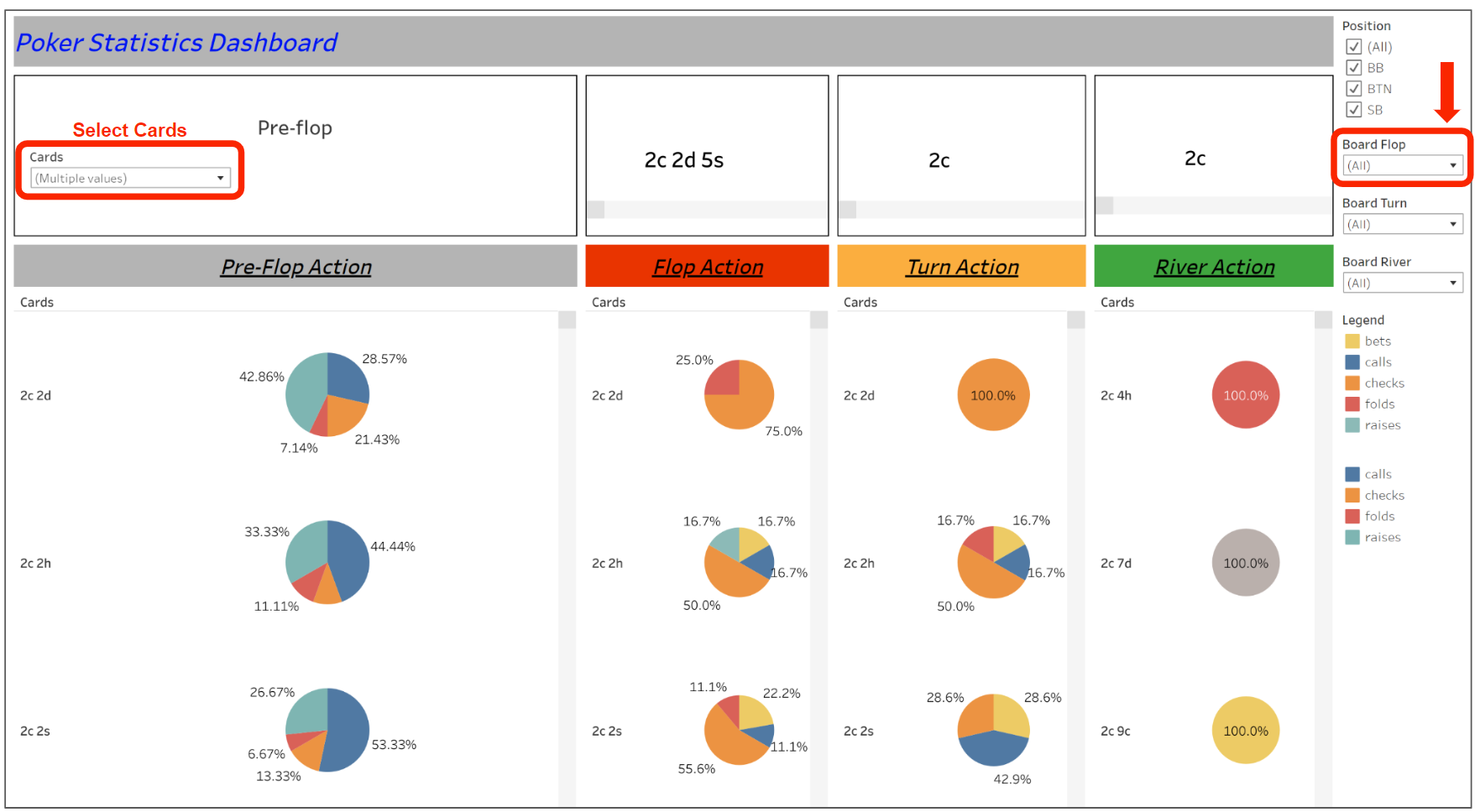
The sample dashboard below (built on Tableau) is based on a poker player's online data and is meant to showcase the player's playstyle based on their hand history. To navigate, kindly use the filters at the right pane to select eg. the board flop and the card's dropdown menu to analyse the player's hands.
The above illustrates how organization and structure can be use to logically display the flow of the game from left to right, pre-flop to flop, turn and then river. With the use of select filters from the right pane, the dashboard is also able to allow some deepdive anaylsis into particular situations.

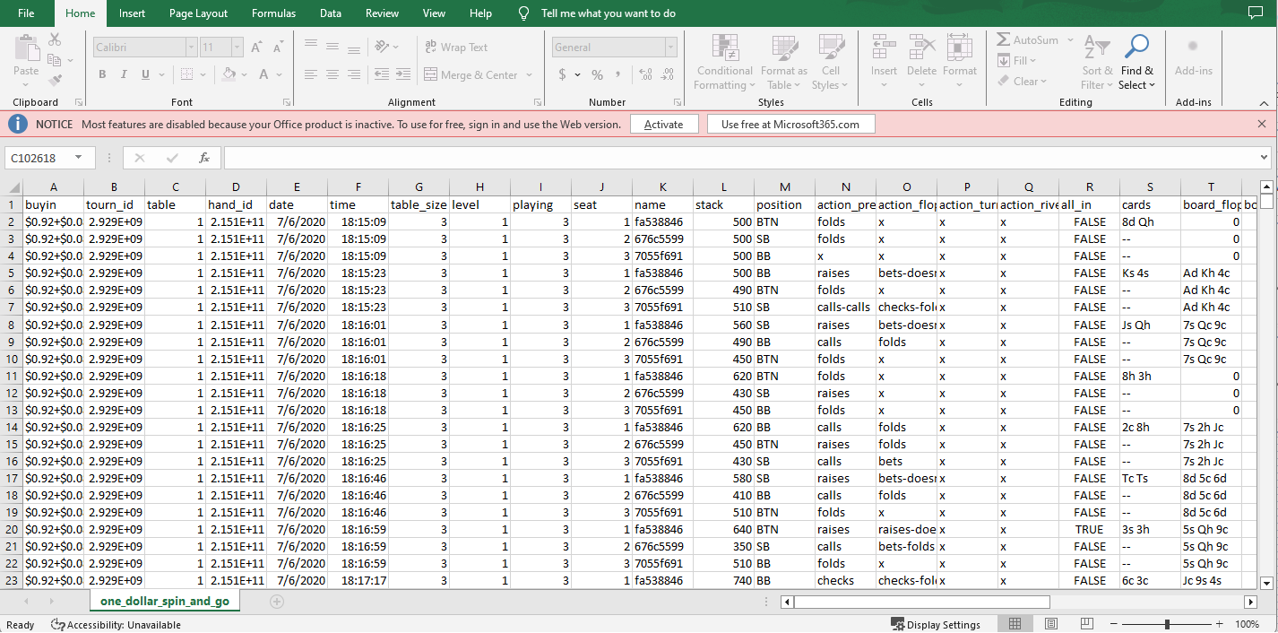
The visualization is also aided with the use of a few colors and shapes to help with insights into the player's decisions (eg. bet/raise/fold) in different hands and different board states (eg. flop/turn/river). This demonstration showcases how seemingly abstract data with >100k rows in tabular format can be quickly converted to simple visuals that can facilitate better understanding of the underlying source.
