The example below is based on 2 different datasets with some information on SG properties and meant to demonstrate how storyboarding can be used to showcase any narrative from the underlying data. Kindly use the panes at the top (left to right) to navigate between the different "stories".
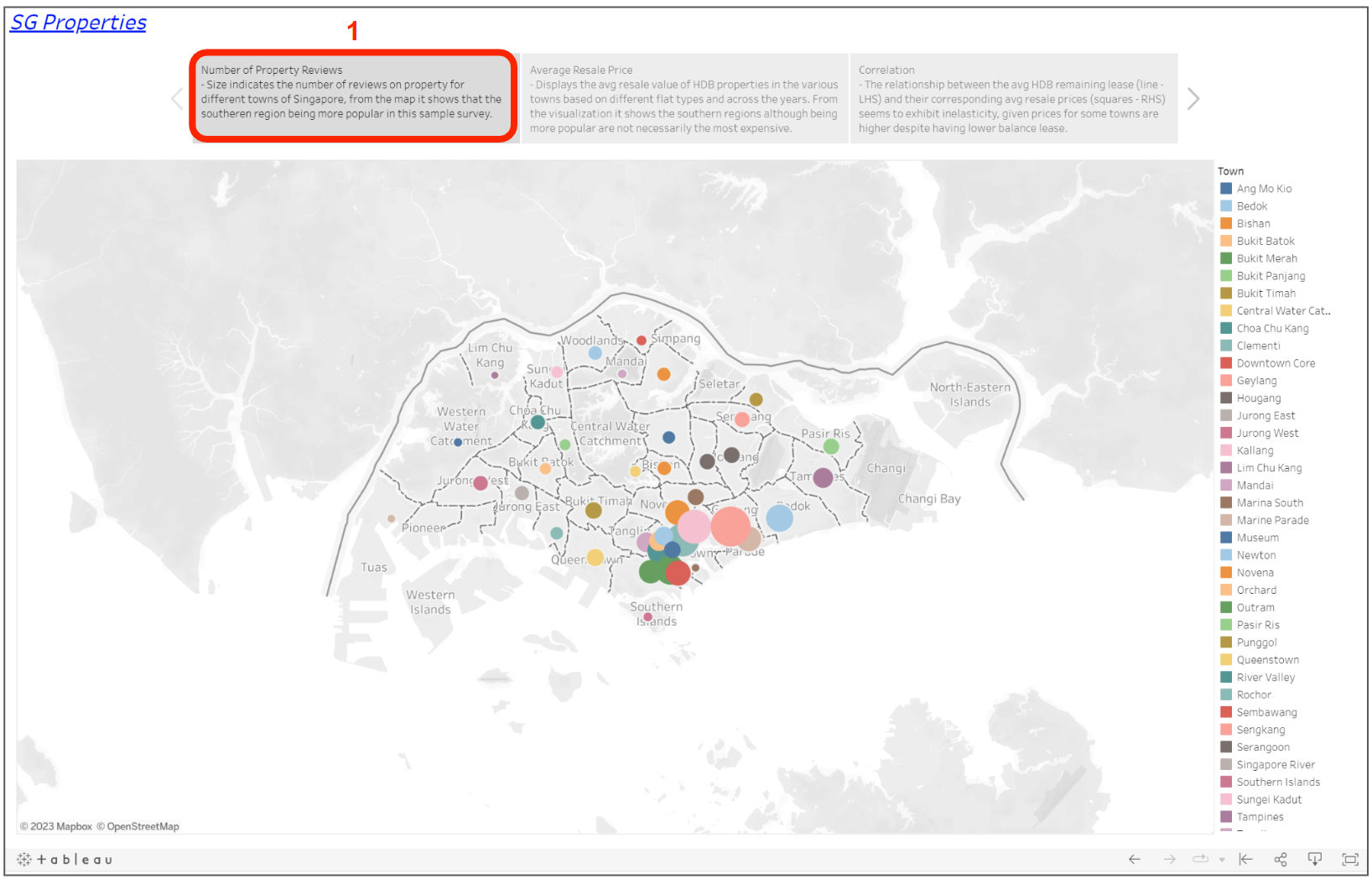
The first pane on the left utilizes a geomap to display the number of reviews for each town. Combined with the sizing of each circle, bigger representing larger number of reviews, gives the insight on southeast region being more popular having a concentration of large circles, according to this sample survey.

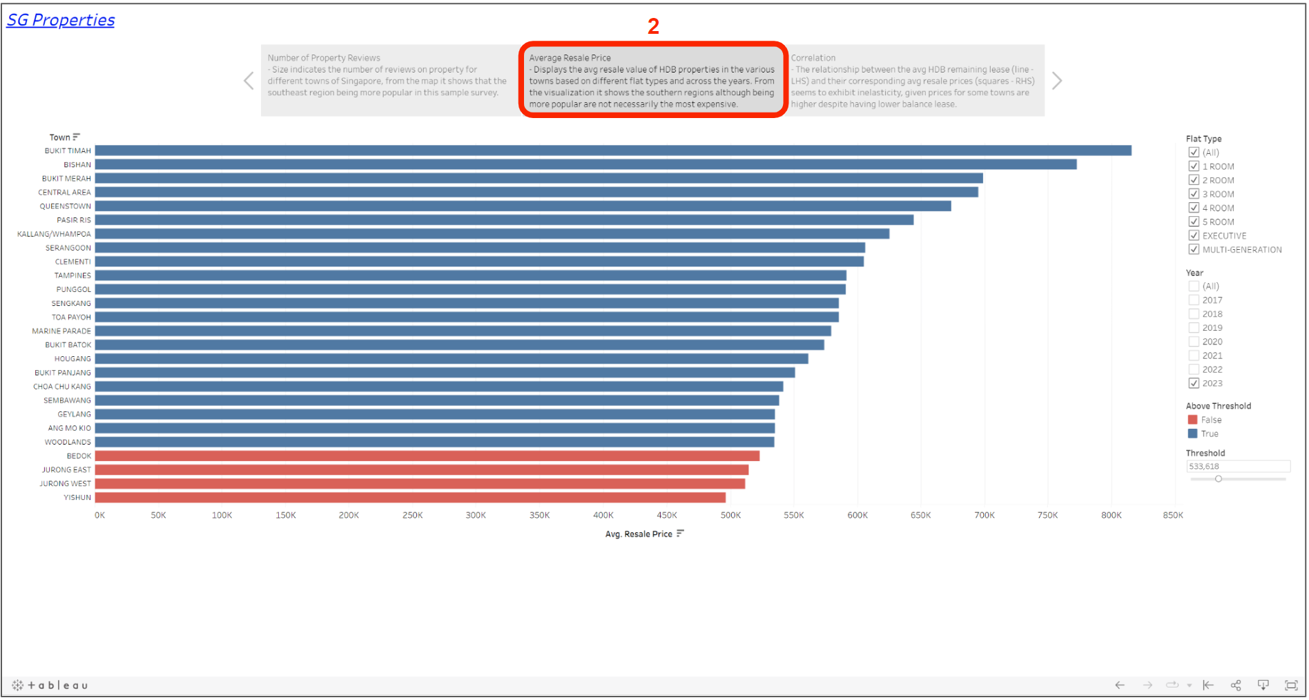
Moving to the second pane, the chart displays the average resale value of HDB properties across various towns. The takeaway here shows that "popular" locations are not necessarily indicative of higher HDB resale prices and illustrates how storyboarding can be put side by side to showcase the narrative on the underlying data.

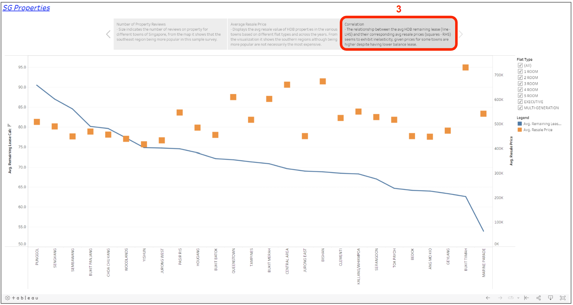
The third and final pane charts the average HDB resale value (squares) against the average remaining lease (line chart). It can be observed that the line and squares do not converge hence it would seem that the number of years remaining in the lease has little correlation with resale value.

The main takeaway is that storyboarding allows users to create a compelling and interactive narrative where audiences can be guided through the data analysis process, emphasizing key findings and insights.